The shape of calm
Calm has a shape. We are not always able to draw it, but we recognize it instantly when we see it, and we feel its absence even more strongly. A room that is ca...
Calm has a shape. We are not always able to draw it, but we recognize it instantly when we see it, and we feel its absence even more strongly. A room that is calm has a particular geometry; a face that is calm has a particular set of proportions; an object that is calm has a particular silhouette. Designing for calm, then, is not about adding a quality. It is about finding the shape that calm already has, and refusing to deviate from it.
Soft edges, hard work
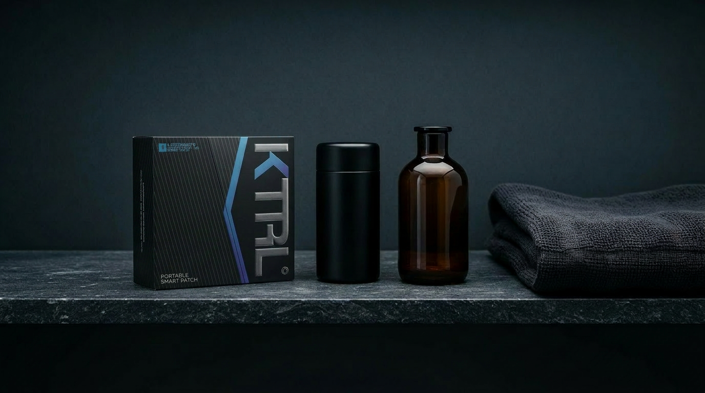
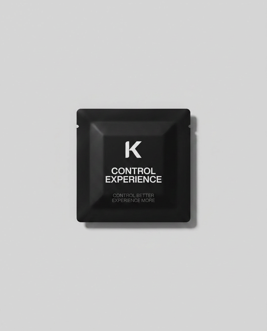
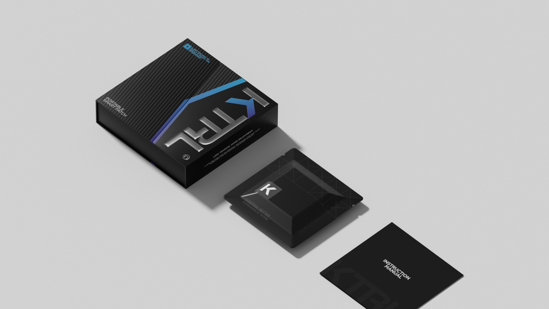
The simplest and most consistent finding from our research is that calm objects have softened edges. Not rounded — that is a different thing — but softened, which is to say that the corner has been chamfered or radiused just enough to remove the visual sharpness without making the form look puffy. This is harder to do than it sounds. A radius too small reads as a manufacturing accident; a radius too large reads as a children's toy. The narrow band between these two failures is where calm lives, and finding it requires a hundred small revisions.
We measured the radii of objects we found calming — a smooth river stone, a vintage Braun radio, a porcelain teacup — and discovered that they clustered, almost without exception, around two to four millimeters. There is something about that range that the human eye reads as resolved rather than aggressive, and as intentional rather than soft.
Neutral but not absent
Color is the other axis. Calm objects tend toward neutral palettes, but neutral does not mean grey. The most calming colors we tested were warm off-whites, soft bones, pale stones, and deep obsidians — colors that have a temperature and a personality, even when they refuse to compete for attention. A pure cool grey, by contrast, often read as clinical or institutional, regardless of how perfect the geometry was.
Our final palette for the patch — bone, ice, silver, obsidian — emerged from a year of testing. Each color is muted but not dead. Each one has a faint undertone that comes alive in different lighting. The bone reads warmer in lamplight and cooler in daylight. The obsidian shifts from near-black in shadow to a deep blue-green in direct sun. These are not accidents; they are the result of mixing pigments slightly off the obvious recipe, on purpose.
Neutral does not mean absent. The most calming colors have a temperature and a personality — they simply refuse to compete.
Proportion, the silent variable
Proportion is the variable that almost no one notices and that almost everyone feels. The patch is sixty-eight millimeters on its long axis and forty-two millimeters on its short axis — a ratio of roughly 1.62, which is the golden ratio rounded to the second decimal. We did not set out to use the golden ratio. We arrived at it through six months of iteration and only discovered, at the end, that we had landed exactly there.
This is, we suspect, why classical proportions endure. They are not impositions of a mathematical rule on an unwilling form. They are the shapes that hands and eyes, given enough time, will always find. The work of the designer is to give the form enough time.
An object you don't have to think about
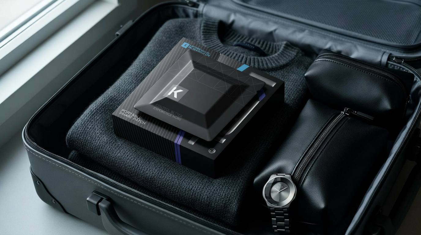
The final test of a calm object is whether you stop noticing it. After two weeks of living with the patch on a nightstand, the people in our extended testing group reported that they no longer registered it as an object. They reached for it without looking. They moved around it without seeing it. Asked, at the end of the trial, what color it was, half of them got it wrong — not because the object was forgettable, but because it had become part of the room rather than a guest in it.
This is the shape of calm: an object so resolved in its geometry, so settled in its color, so honest in its proportion, that the room absorbs it. The work, in other words, is to make a thing that disappears. Everything else is decoration.
Comments (0)
Please login to comment.
No comments yet.